Hop 1: Hop On!
In this little simple pastel platformer you'll play as the fluffy and adorable Bun! With a day on the project I got some of the basics set up and ready to go. If you're not into reading in-depth behind the scenes content; this probably isn't for you. If you do though! I love writing fun devlogs for my projects.
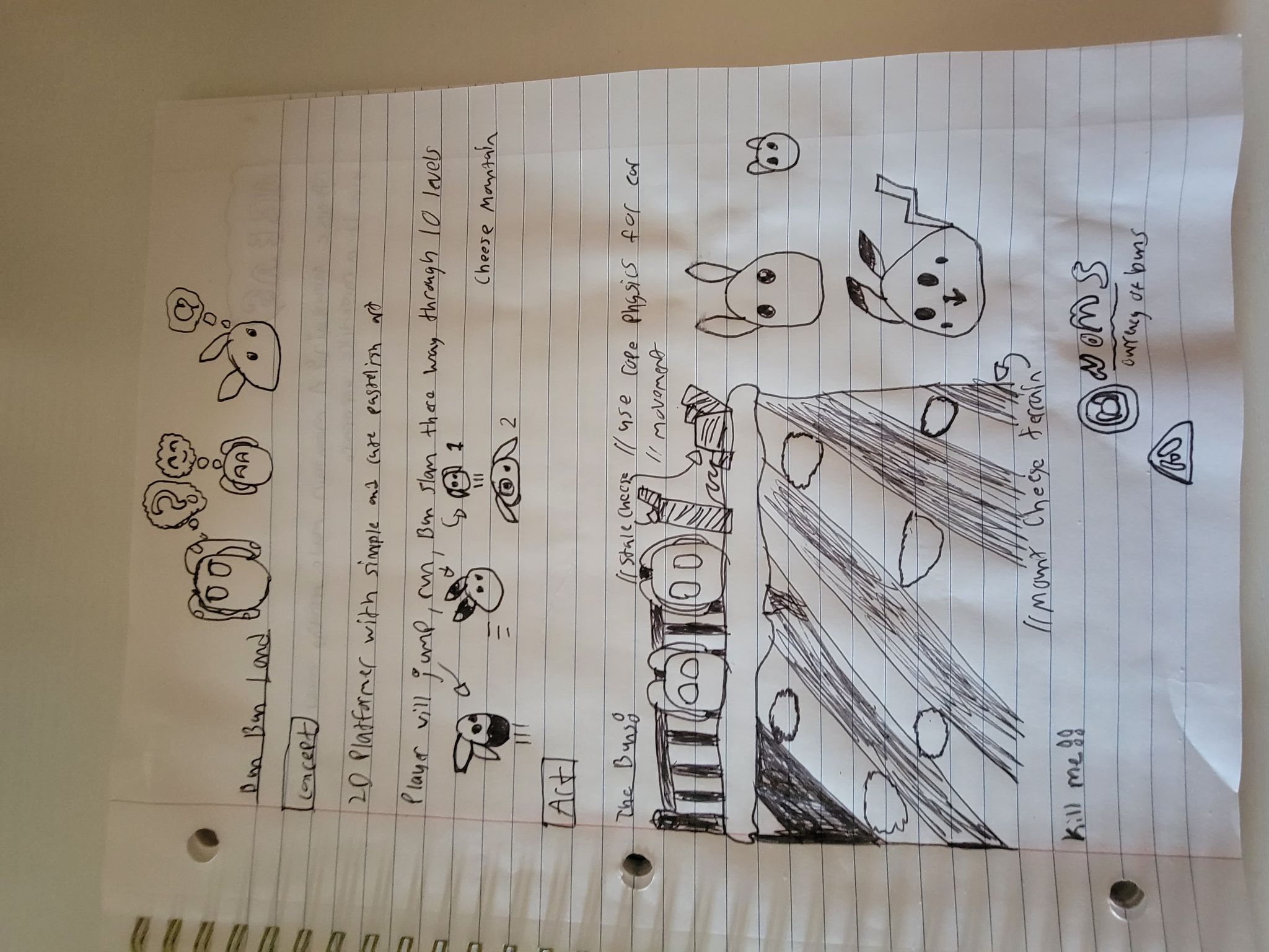
To start I took this notebook sketch out and went to prototype
This isn't an organized and well documented design document; it's a chaotic sketch of my thoughts. Trello is for organization; my notebook is for out in the wild designing. The main takeaways were, I like this weird cheese mountain area, I need to make a cute bunny sprite set to use with cutout animation; and it needed to do basic movement.
I started by making the studio splash screen! I really didn't want to start doing any real work; but this seemed like a fun entry into the project. I had to make the bun visual anyways; imagine that you can't run away from the work you put in front of yourself. This was pretty fun and simple though! I didn't end up using "rope" physics for the ears at least not yet. I kinda forgot about it, but, I also don't wanna spend a ton of time on that minor level of detail until later. The most it'll cost is a few minutes of animation; which I'm fine with paying later.
I decided on my normal splash screen for 8BS but with a twist!
There's still some work to do with it of course. This first build is just the bare minimum needed to get a little bit of gameplay going. But polish will come over the future updates!
After this I needed to make a character controller! My experience with character controllers in Unity is very very little; but I love a challenge! After a few hours of struggling to iron out a few bugs; I think I have a pretty alright controller. Things can get smoothed out and fixed up as time goes on. The character controller was hooked up to the Bun animation rig and off I went!
To test out the character controller I made a small test scene. Now, I love Mario Sunshine, I think a lot of people do, as a kid the Mario Sunshine main menu threw me off so much in a great way. The way you actually selected menu items via character interaction was a wild concept at the time. I was in love and sad that most games never did that after. Between games like Dead Space where the UI is minimal and Sunshine where the UI was built into gameplay at times; this style of interactive minimal has become the pillar of my UI.
I converted this test area into the main menu! It's not super polished or what I want in the end; but for right now it's pretty decent!
I'd like to make it a little more interactive like the Sunshine menu; but it works for now.
Once I wrapped up the main menu I had pretty much everything I needed to start on a test level. So, I made one with the idea of something quick, simple; and doesn't need to be an actual level. Just a extended scene for players to try out the character in. So it's very rough and not at all what the final levels will be like; just something simple and quick to get it out there.
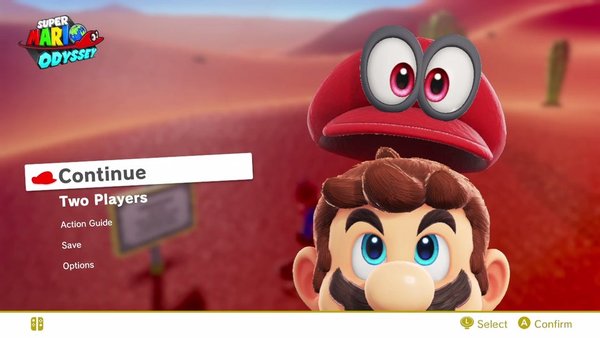
At the end of the day I knew there was one more thing I knew I needed....a PAUSE MENU. I don't know if it needs to be said; but I hate UI work...it's just so time consuming, difficult to get just right; and painful. But it has to be done. I first was going to go with the Mario Odyssey pause menu where it has a minimalist option buttons, a blurred background; and the player presented in the middle.
While this seemed great I wanted something a little different. Plus I've used this pause menu style multiple times; it's my go to style since it's so clean. But I wanted something different.
I then thought of making a little pocket dimension area that would serve as an interactable pause menu. But the work I'd have to do just didn't feel like it'd be really worth it; more so getting to all the settings was a painful thought. I'd like to make this a very accessible game and an interactive menu could work with that; but it'd take a lot of extra steps that players would then have to jump through for basic changes.
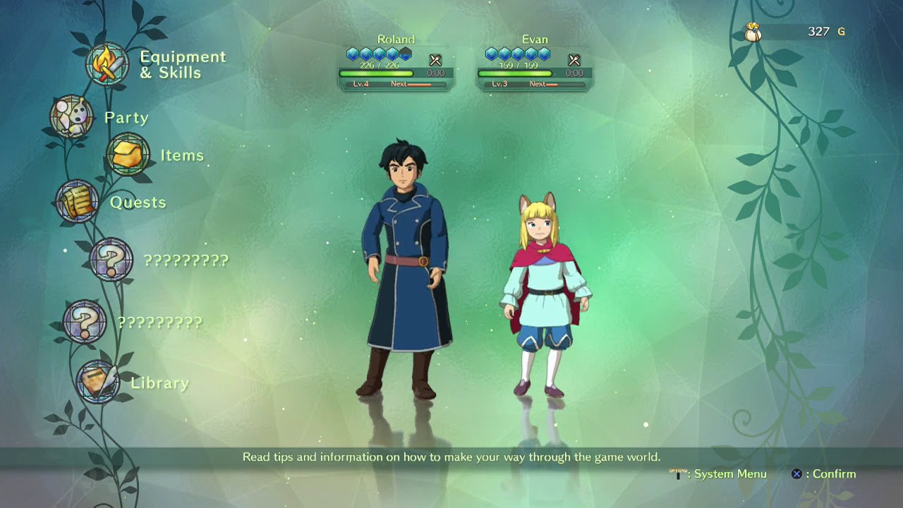
Then I remembered the Ni no Kuni II menu which I loved! It was simple and clean like the Odyssey menu; but it had extra personality.
I went ahead and made something very similar to this, later I'll work on making it more of its own cute little menu; but I needed something functional for now. That's when I made this!

Pretty simple and clean while having this nice and light cute atmosphere! There's some text blurring it looks like and other small things I'll need to polish; but that can all be fixed up later on.
And yeah that's it! This game is a VERY simple and cute platformer. While other games are focused on innovation and being unique; I just wanna make something that reminds me of Yoshi's Island a little bit or Yoshi's Story. If you like cute and simple games this might be for you! Give the game a follow and enjoy the updates!
I am working on a Steam release for this. If you look at the other games that have sat unfinished or dormant for now and are thinking "Sure man sure". I understand, but, I'm putting the money down on it and getting a little page put up hopefully within the next month. I believe Steam has a 30 day review period before I can actually put up a page. But I'll update the news on this as updates come out!
Get Bun Bun Land
Bun Bun Land
Hop your way to adventure!
| Status | In development |
| Author | 8 Bit Simple |
| Genre | Platformer |
More posts
- Hop 5: BUN SLAMMIIIN!Jun 07, 2022
- Hop 4: Hazardous OccupationJun 06, 2022
- Hop 3: The Grim BunMay 28, 2022
- Hop 2: Bun Bun MakerMay 21, 2022
Leave a comment
Log in with itch.io to leave a comment.